
facin_ated
I’m drawn to the space between what is and what could be — where thoughtful design has the power to shift perception, elevate experience, and create something lasting.
Although I’m a structural thinker, I’m fascinated by how design is felt. The rhythm of a layout. The weight of a material. The balance of color. The subtle decisions that quietly shape how we experience a space, a story — a brand.
Across industries and mediums, I’ve found myself most inspired by lifestyle-driven work, where identity, experience, and environment come together. To me, lifestyle isn’t a necessarily a category, it’s a feeling. It lives in the details.
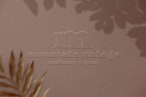
IDENTITY, DISTILLED
Every brand deserves a voice as distinctive as the people behind it.
These identities are built to do more than be recognized; they’re designed to create lasting connection.

for the aspiring chef creating an outlet to tastefully share and connect

for the nationally established real estate agent leading legacy with authorship

for the passionate entrepenuer
grounded in sustainability and community

for the creative behind the lens documenting culture as it unfolds in the concrete jungle

TATTOO MEDICS
Just like there are bad tattoos, there is also bad branding. I collaborated with TattooMedics to reform their aesthetic — typography, color theory, vision —
while maintaining their signature logo and respecting their prestige and presence.
The refreshed brand came to life through a redesigned website that balances beauty with function. Clean hierarchy, intuitive navigation, and patient-first messaging create a seamless experience that feels refined, trustworthy, and easy to navigate, allowing the brand to work just as hard online as it does in print.


THE RANSON COLLECTIVE
Building identity within identity. I collaborated with one of Denver’s top-producing real estate agents to create a distinct brand that reflects her personality while remaining thoughtfully connected to her brokerage aesthetic.
The resulting identity extends far beyond a logo, shaping everything from marketing materials to presentations for architecturally significant new construction.
Some of the most compelling spaces haven’t been built yet. Through architectural renderings, curated finish palettes, and intentional storytelling, we transform ideas into experiences, giving buyers the confidence to envision a home long before construction begins.


MOUNTAIN SAFE EXTERIORS
Mountain Safe Exteriors already had a strong foundation. The opportunity wasn’t to reinvent it, it was to refine it.
In an industry crowded with competing messages and overwhelming visuals, we chose a different approach. By prioritizing clarity, thoughtful hierarchy, and a more approachable visual language, we created a brand that makes information easier to find, easier to understand, and ultimately easier to trust.

